Tuesday, 20 December 2011

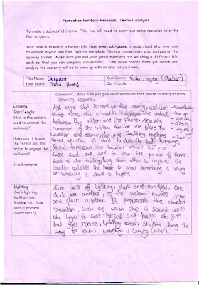
Marking previous student work

Hamilton court

Level 4(48-60)
From the opening until the end it is identified as a horror film by the mood, sound and the mise-en-scene that is created in the opening.
It uses different types of angles and shots such as low/high angle and long shot in the beginning to show the location, close up and mid shot when the character talks over the phone used to show little bit of detail(face expression) etc.
It is very well framed as the character stays one side of the room, while moving from one place to another. Doesn't break any rule of third.
Over all the continuty is good(180 degree rule). It doesn't break but flows through the whole sequence, such as when one shot changes to another, mid to long shot and i can see the new character coming in at the corner(ghost) when the other character talks over the phone.
The mise-en0scene is used successfully, such as the costume/make up(the ghost, white dress, pale face/dark eyes and long hair, lighting like when to make it dark and bright etc.
The use of sound is used to create fear then the action. It goes well with each scene which creates the mood such as we see the ghost, there is a tension in the mood by the music.
Overall its really well filmed as it uses all techniques and control/attracts the interest of the audience.


Roxanne

Level 1(0-23)
At the start it doesn't look like a horror film util towards the end, as it doesn't use any technique that will make it a horror film. It doesn't make any sense of where the character is coming from or when/why the action should take place.
It does use few types of camera shots, such as mid/close and tracking when the character moves from one place to another. However could use more(like in the horror films) to create a good scene.
It is well framed and good use of continuity at the start of the sequence however breaks the rule of thirds and 180 degree rule towards the end when the girl attacks the guy, can see the sides changing(left to right, seemed in).
It doesn't use any mise-en-scene such as make up/costumes are very normal, not used specifically for the characters like the killer or victim. Attacks normally take place at night with specially lighting however in here it happens during the day with black and white effect, which doesn't make any sense.
Sound are used very little, even just one type and rest is just silence. It doesn't grab the attention or make it scary. 
Overall very bad, can identify its only been shot once without any planning or preparation(wasn't sure of what they were doing).. More like a comedy then a horror film.

                                                                                               By Sadia

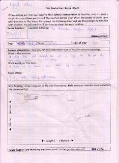
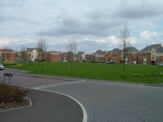
Location photograph


Monday, 19 December 2011

Mind Map


This is a wordle of genre ideas of what I will be including in my film, e.g. blood, car, house etc.

                                                                                                By Sadia

Wednesday, 30 November 2011

Story ideas


           Idea 1: In our first sequence of our film we will be showing the escape of the killer from the metal asylum. An alarm will be raised as the killer will try to walk out of the asylum in a very angry mood taking any security guards in his way. This will show that the killer is unstoppable and even trained security guards won’t be able to defend him. Our sequence will end with the psycho outside of the asylum, standing and feeling his freedom and also know that a mental killer is on the run (no sign of where he is or what he will do, just wanted posters everywhere).

          Idea 2: In our first sequence of our film, the scene will start with the camera panning the location/place. Suddenly light will come on and four people will be shown, seating tied and blind folded surrounded around a table. Killer will be shown as he moves around the victim (hidden under the mask), holding an axe. Flash-back will be shown as each victim blind fold is taken off. First victim, men who used to bully him in school, got him into detentions, tortured and stole his lunch money. Second victim, his ex-girlfriend who cheated on him, anger grows inside as he sees his girlfriend with another man. The sequence will end with the psycho killing his first victim with an axe, dialogue: who’s next?


         Idea 3: In our first sequence of our film, the scene will start with the camera showing a high angle of the location (Arboretum). Two people will be shown (one male and one female) walking down the road towards the tunnel. A guy dressed in black(wear a big jacket and mask) hiding/stalking behind and aside the tunnels.

                                                                        Unknown and mysterious

The scene will end with one victim being horrifyingly killed and another victim trying to escape from the park. Will leave the audience in a puzzle, who is he? What is his motive? What’s the story and will the victim be able to survive?

Pitch Presentation: Comments


    Saturday, 19 November 2011

    Q5 - Reflective Evaluation

    Audience and certificate research

    IMDb
    Earths Biggest Movie database


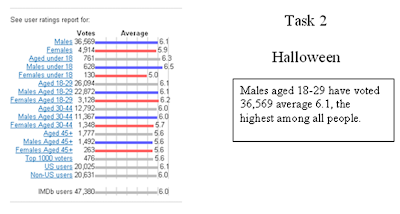
    From the user rating “A Nightmare on
    Elm Street
    ” has been rated the highest among all five movies.

    Our targeted audience will be male who are 18 or above because as evidence state genre such as horror/slasher and mystery interest males aged 18-29 more than other audiences. It is more likely that male’s tent to watch it more then females as this genre appeals and interest them more. And age under 18 or 18-29 more then 30+ due to its disgusting scenes which older people may not like. However it purely depends on the movie, some films like Scream appeal to female as much as the male in terms of the story as it shows less violence then movies like Friday The 13Th.


    BBFC
    British Board of Film Classification

     No one younger than 15 may rent, buy a DVD or see a ‘15’ film in a cinema. This rated films are not allowed to show any strong inappropriate scene or use language. E.g 
    Drugs: Taking drugs are allowed to show however the film as a whole must not be based on something that encourages drug use.
    Language: They may be a frequent use of language such as "FUCK" or "CUNT" however not something repeat or aggressive that may influence the audience.
    Nudity: It may be allowed in a sexual context but without any strong detail(full nudity). 
    Sex: Sexual activity may be portrayed but without strong detail. They may refer to the sexual  behaviour but not allowed to show the actual thing.
    Violence: Violence may be strong but should not be shown in detail way, dwell on the infliction of pain or injury.
    .................................................................................................

    For our film we will be using "15" certificate because we will showing some violence and swearing but not strong enough for use to the "18"

    certificate. We could have used the "12" but they maybe some scene that can be inappropriate to the certificate so for us "15" certificate is the best option.


    Online Survey


    First Response


    Comparing Scenes


    I have chosen this clip to reach my targeted audience because it shows the genre of the film (slasher). It shows the similar scene that is shown in other slasher films, e.g. isolated place(woods), a teenager victim/ mysterious male killer and use of violence, body language and costume/prop. This gives the audience a idea of what the genre is and what they can expect so it will interest them to watch more.

    Comparing Friday The 13Th which uses similar scene e.g. isolated place(woods), teenage victims/ unknown male killer and use of violence, body language and costume/prop, however its strongly used which gives a much clear idea about the genre then the woods. For example the scene starting with a teenagers coming for a camping trip and talking about the history of place and someone watching from the back. The video shows show they killer kills its victim using a axe.

    Tuesday, 15 November 2011

    Sadia's Film opening research

    Halloween


    The sequence begins with an extreme long shot of a house, zooming in towards the door. A point of view shot of someone stalking the people in the house (a male and female, lovers). As the stalker, carrying a knife moves from one room to another it gives a hint of someone is going to die.
    The female dyeing first makes her venerable and puts men on the spot. It gives a hint that the men might die next, however because of the ending (a little boy being the killer), makes in unpredictable of what will happen next.

    It engages the audience by the ending, where the little boy is shown as the killer. It shocks the audience and makes want to know more, what will happen next moreover, what is the story, keeps the interest and mystery so the audience wants to watch more.

    The title is integrated by zooming into a pumpkin slowly in darkness, along with the production and cast crew of the film. There are no specific visual used, just black background and title in a old fashion font. The institutions that are shown are the name of the production such as the cast and crew. It uses less detail and moves directly into the movie, opening sequence.


    Nightmare on Elm Street


    The sequence begins with a girl (victim) in a white dress standing in a old factory, looking confused and scared. It makes her look vulnerable as she tries to find her way out, trying to run away from a mysterious killer who he follows her through the factory carrying a dangerous weapon.
    The next scene (what will happen) is as a mystery and unpredictable when whole thing shown as a dream. However, tells us the story will be based on her and men in her dream (real or in dream) will come back again to kill her.

    It engages the audience by the ending of the opening sequence, where it turns out to be dream. It makes the audience want to know, what will happen next moreover, what is the story, keeps the interest and mystery so the audience wants to watch more.

    The title in integrated after the title credits sequence, just before moving directly into the opening sequence. In a old fashion style, video being at the top and credits at the bottom. There are disturbing visuals shown, such as machinery factory, unknown person and dangerous equipments on the wall. As if, he is preparing to kill someone.
    The institutions that are shown are the name of the production and moviemakers. It focuses more on the visuals then the credits, short and fast.

    Monday, 14 November 2011

    David's Title Research 2

    Halloween

    In the opening title title to this film we are shown that the killer is murderous ever since he was a child. The film also tells us that the killer likes to wear masks to hide his identitiy when he kills his victims, this could be because the killer doesn't want people to know who he is or to scare his victims. The openign title also tells us that the film is set on halloween because the camera slowly zooms into a pumpkin, which is associated mostly with halloween.

    The font is in a very halloween format as it looks quite old and creepy and is also orange like a pumpkin. The font changes to a white colour which could represent coldness.

    A few visuals in this title show that this film is a slasher such as the child stabbing his sister multiple times with a knife to kill her very agressively. The screams from the girl also relate to the slasher genre as they are signs of terror/fear.

    I have learned that the first person view used by the killer in this title scene is a very good idea as it hides the identity of the killer but shows his way of sneaking up on his victims. I also think that the idea of focusing on the victim is good becasue it can give the audience a connection with them so they can realise how vulnerable/innocent the character is.
    -David 


    David's Title Research

    A nightmare on elm street (2010)


    In the opening title the audience are shown the making of of the murder weapon thats is used by the killer. The film doesn't show the face of the killer in the opening title to intrigue the audience as to what he looks like. We also see a photograph covered in blood, which could be a victim that the killer is hunting or has caused him pain in the past. In the opening title we are also shown that the killer is quite intelligent and good with his hands as he builds the murder weapon himself with no design plans.

    The title credits are presented with a black bacgorund in a simple bright red text to represent blood or danger. This style of font is effective for a horror movie because people associate black and red as negative or dangerous colours. The text in the opening sequence fade in and out to make the movie seem more mysterious.

    Before the title of the movie is shown the screen is scratched by a claw. This relates to the murder weapon used by the killer and is also a very bright red colour to seem as though human flesh has been scatched. The voilence of this relates to slashers well as the genre is associated with the deaths of many characters.

    From this title sequence i have learnt that showing the killers weapon of choice is a good and effective idea for a slasher movie as the audience will see alot of it. I have also learnt that a characters signature weapon is good for a slasher movie as people associate characters with their weapon e.g. a knife for Micheal Myers, a machete for Jason Vorhees and the glove for Freddie Krueger shown in thsi movie. The opening to this film has also inspired me to use red font for titles because it relates to blood which is ideal for a slasher movie.      
    -David

    Evaluation of our remake

    Use of the camera
    Our groups finished work shows that we can hold steady shots well. However, this is very easy to do with the help of a tripod so the finished work does not show that we can hold the camera steady as we used a tripod in all of our shots. The work also shows that we can frame shots appropriately as the subject in the clip has enough head room and walking room in every shot. We used a variety of different shot types in the filming of the pendant which made the video alot more interesting. we had a few problems with panning shots as the tripod didnt turn smoothly at times. The composition was very accurate to the original, although the setting wasn't the same as the original. The camera angles were near to the original but a few of the shots were at a different angle.

    Use of editing
    We were determined to remake 'the pendant' as accurate to the original as possible. To do this we had to break the 180 degree continuity rule which was broken in the original video. However, if we were to make the film in our way we would have avoided this continuity error. The sun ruined a  few of our shots as it shone brighter at times which made some shots look out of place.  We only used cut transitions in our film as it was the most fitting transition for the scene.

    Selection of content
    The costume and makeup our actor wore was fit for the part as she wore casual clothes making her look like an average vulnerable person, which is the best type of victim for a horror film. The only prop we used in the video was a piece of gold coloured jewerly which was supposed to be the 'pendant'. We couldnt find an exact replica of the pendant used in the original video but it still looked believable. The location we used was appropriate as it had a bench, birds and a lake which were all the elements we needed in a video. The area was suitable for our film genre becasue it was in an empty eery park which was good becasue the sound of trees and birds added to the physological horror by making the audience think the character was being watched. The actor we picked for our film was suitable for the part as she was a female which is traditionally a vulnerable victim in a horror film.

    Self assessment
    During the filming of this film i helped directing the actor in the scene and by setting the camera up in the right position for each shot type. I also adjusted the settings on the camera to correct the brightness, focus and white balance. During the editing process i trimmed some shots and put them together. The finished film could be improved by changing the brightness of some scenes to match the rest of the film as the sun shone in some scene which was a rather annoying continuity error. In our final coursework peice we will film each shot more then three times and using different shot types to give us a bigger choice of shots to pick from.

    -David 

    Saturday, 12 November 2011

    Sadia's TITLE RESEARCH 2


                                                                   "Criminal Minds"
                                                                  Behavioral analysis unit


    The opening title sequence gives information about the characters who will be playing in the serials, place such as office, street, lab etc and in a different but clear way of sketches of people, piece of newspaper etc. It give an understanding about what the serial is about, crime and investigation(solving cases).


    It is presented in a format of a page, a person on one side and other images an another. Use of black background represents seriousness and realistic things. As each character is shown, images change around them, which gives an idea of what each character will be investigating.


    Visuals such as images of newspaper, map, alphabet/number etc are shown to give an idea of whats its about. Even through the opening sequence is short, it presents in a very detailed way. It relates to the genre, clear and understanding(crime and investigation).


    From the title sequence i have learnt to use the detailed that is used, format and style. However make it maximum 1 min and use more images that represent the title and genre. It will make it more clear.

    Sadia's TITLE RESEARCH 1


                                                                        "True Blood"

    The opening title sequence gives information about many different things that's going around the world. Some things that are less natural and more abnormal, such as forest(dead trees and animals), old home town/pub, a child eating blood etc. Basically shows every bad things that happens around world, past VS present.

    It is presented by using different images, such as when it shows the past it goes black and white and when it shows present it comes back to colour again. Music is also represented to give an idea of what its showing e.g. people in the pub "i wanna do bad things to you". Names of the cast and crew, so its identified who will be playing presented at random sides of the video.

    As lots of visuals images are used however doesn't give a clear idea about the title at first. It goes more clearer when it starts to show abnormal things such as a boy eating blood, dead animals. It give an idea but still doesn't fully related to the genre(thriller and horrified things). 

    I learned from this video is to use the techniques that is used(very good and creative). However be more clear and connect more towards the genre/title in stand of just showing different images.

    Thursday, 20 October 2011

    Remake of Pendant

    The shooting of this video went very well, although we came across some problems with the lighting and the bench that we initially planned to film at, had been removed the previous day. Unfortunately, we only caught 26 seconds of usable footage after editing. A few of the shot's wobbled a little, due to poor handwork of the cameraman. Also a few members of the public ruined our shots. We found it a little frustrating that the sun was emerging and retreating throughout the filming process.

    Continuity: The continuity in the video was overall very good, however, when the pendant was thrown into the water, the actor used her right hand, indicating it would come in from the right, but the pendant came into the shot from he left. Also, the sunlight changed the scenery a few times in the video.

    Composition: The composition was very accurate to the original, although the setting wasn't the same as the original. The camera angles were near to the original but a few of the shots were at a different angle.

    Wednesday, 12 October 2011

    Composition Exercise

    I think that this exercise went well, although, the camera shook at points.
    There is a specific shot where the actor is in the middle, to make him seem more isolated which breaks the rule of thirds. In a few shots the camera wasn't in focus. this is an accidental effect caused by the screen resolution on the camera. At one point the camera jumps from one place to another.

    Mel: You have really good framing on some shots, but we need a frame for the point of view, and there are some ad cut offs. When the actor is looking up, have them looking around. More cut away to emphasise the POV. Need to establish POV. Shot/reverse shot!

    Wednesday, 21 September 2011

    First Post

    The skills that we will be learning over the next couple of weeks in Media Studies will involve camera framing and shot types, editing continuity, storyboarding, genre conventions.

    Continuity editing is all about coherence and orientation. If a film maker randomly stuck together a series of shots the spectator will soon become disoriented. Different shot types include, mise-en-shot, the long take, and deep focus photography.